Project01 CategoryVisual Identity DeliverableWeb / Menu / Print IndustryRestaurant

A complete brand identity, live website, and physical menu — built from scratch for a Bulgarian special events venue.

✦
Visual Identity
Logo, colour palette, typography system, and brand guidelines designed from zero.
◻
Website
Fully designed and built live website at restorantbogota.com — responsive, fast, and on-brand.
◈
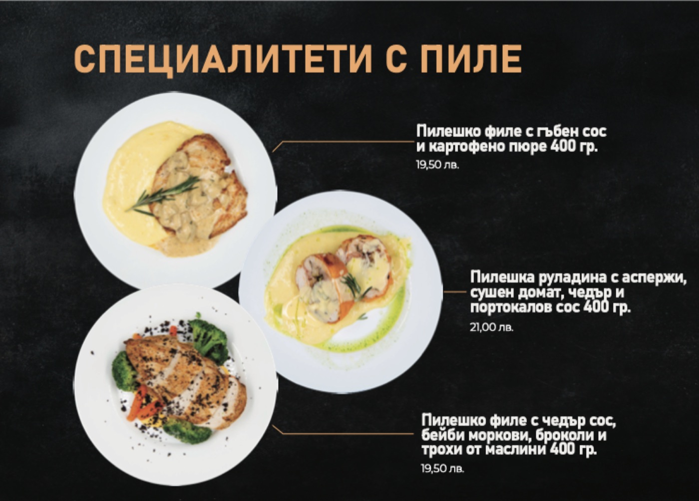
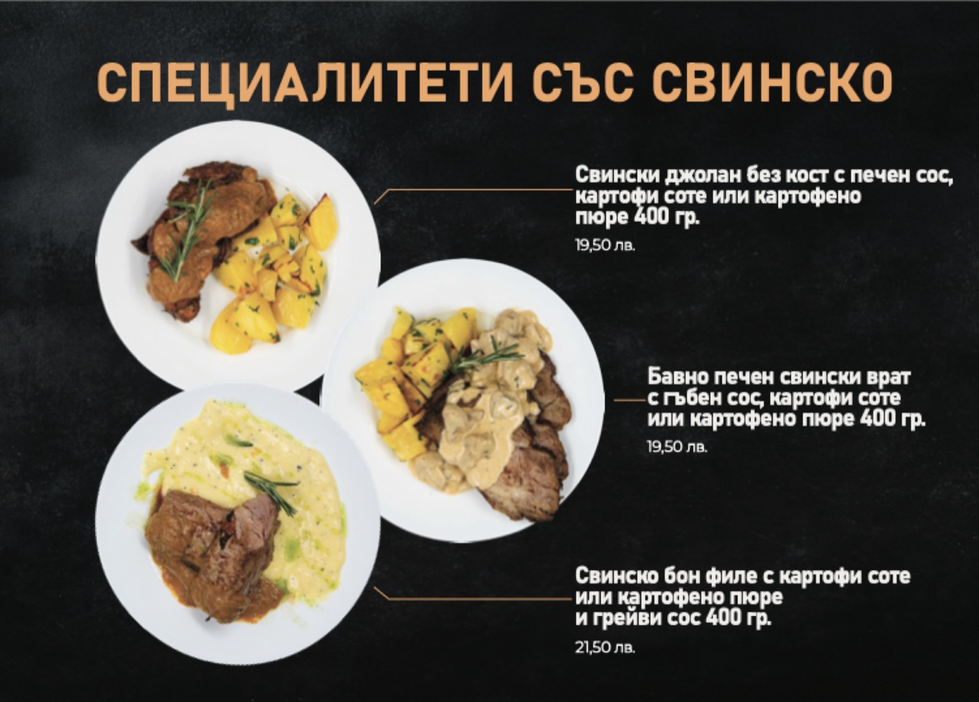
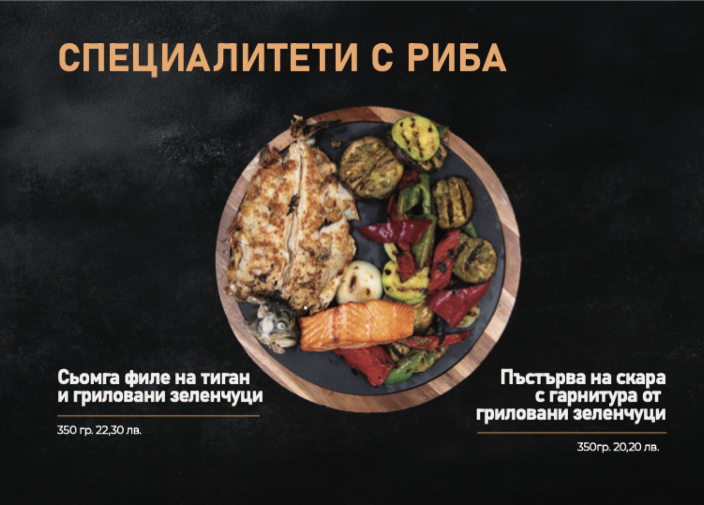
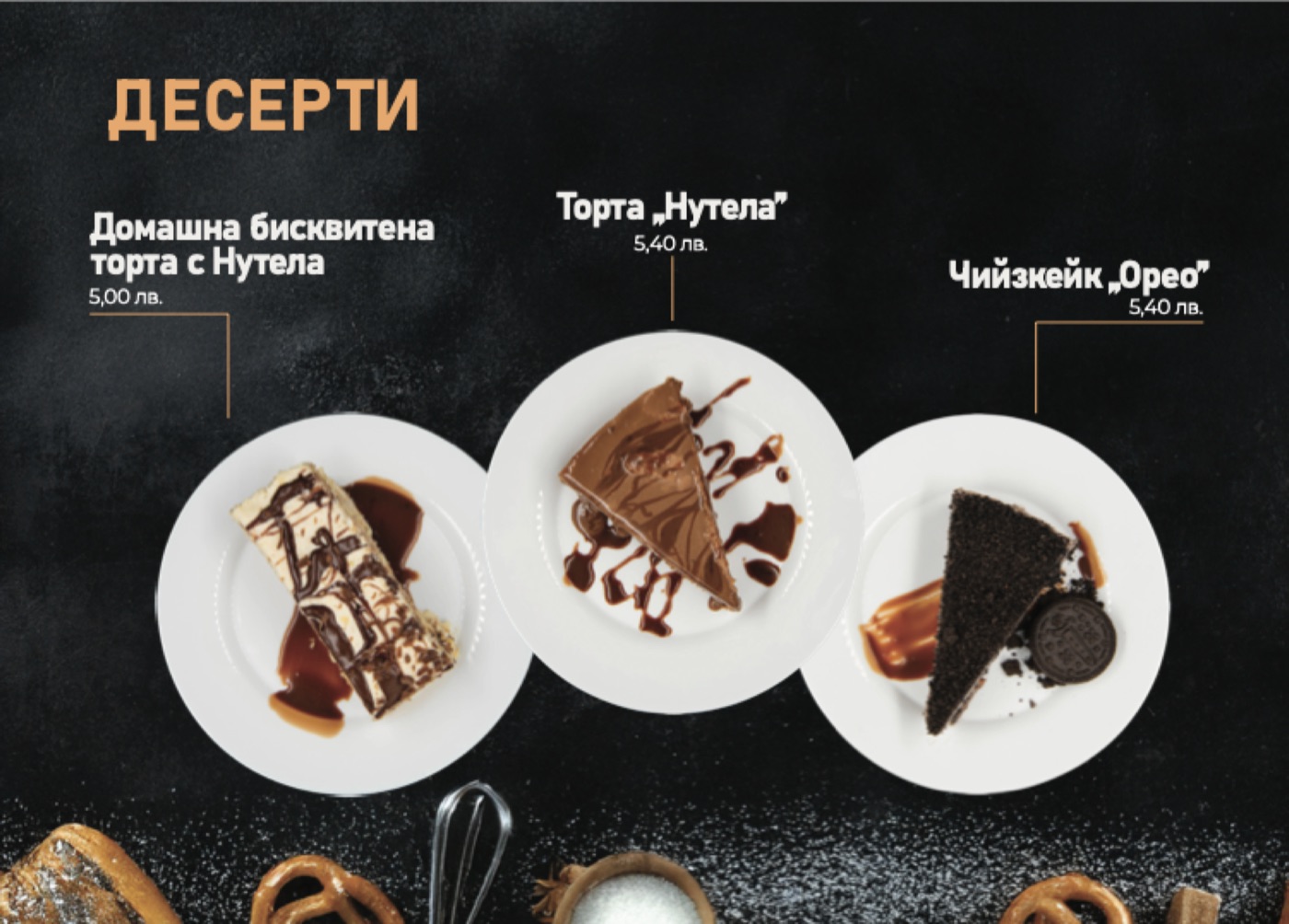
Physical Menu
Print-ready physical menu designed to match the brand — layout, typography, and production.
A venue that opens only for special occasions.

Restaurant Bogota is not your typical dining establishment. It's a private events venue — a space that opens its doors only when there's a reason to celebrate. Weddings, anniversaries, milestone birthdays, corporate gatherings. The kind of evenings people remember for years.

The challenge was building a brand that matched that sense of occasion — dark, warm, and quietly luxurious — without feeling cold or corporate. Every element had to feel like it belonged at the table.

The result is a complete visual system built around deep black, Bogota orange, and a typographic pairing that balances authority with warmth. Designed from scratch — logo, website, and physical menu — all produced and delivered as a cohesive whole.

01 / 09

Primary
Logo

The name in condensed capitals under a handwritten “Ресторант”: authority and warmth in one mark.

On black
On cream
02 / 09

Logo
Anatomy

Two voices: a script for the welcome, capitals for the name, always in that order and always together.

Script — P22 Allyson Pro · Script Orange

Name — Bahnschrift capitals · Cream

03 / 09

Logo
Variations

Full colour on black or cream, a single colour for print and signage, and the name alone where the script can't hold.

Full colour
On light
Single colour
Name only
04 / 09

Logo
Clearspace

x is the height of the capitals. Keep at least x clear around the logo on every side.

x x
05 / 09

Primary
Typeface

Bahnschrift in capitals for the name, the headings, the dishes and every price — it reads at a distance, like signage.

Regular — set in capitals for the name, headings, dishes and prices

06 / 09

Supporting
Typefaces

A script for one word at a time, a serif for the occasional quote, and Montserrat for everything you read.

Script — P22 Allyson Pro
Editorial — Garogier

Зала за Вашите специални моменти — ресторант с характер.

Body — Montserrat
07 / 09

Colour
Palette

Black does the quiet work, orange the loud: one or two orange spots per page, never more.

SurfacePrimary Black#10100F
RGB 16 16 15
PanelsAlt Dark#1A1A18
RGB 26 26 24
PrimaryBogota Orange#FF5C00
RGB 255 92 0
ScriptScript Orange#FAAB64
RGB 250 171 100
PaperWarm Cream#F5F1EA
RGB 245 241 234
08 / 09

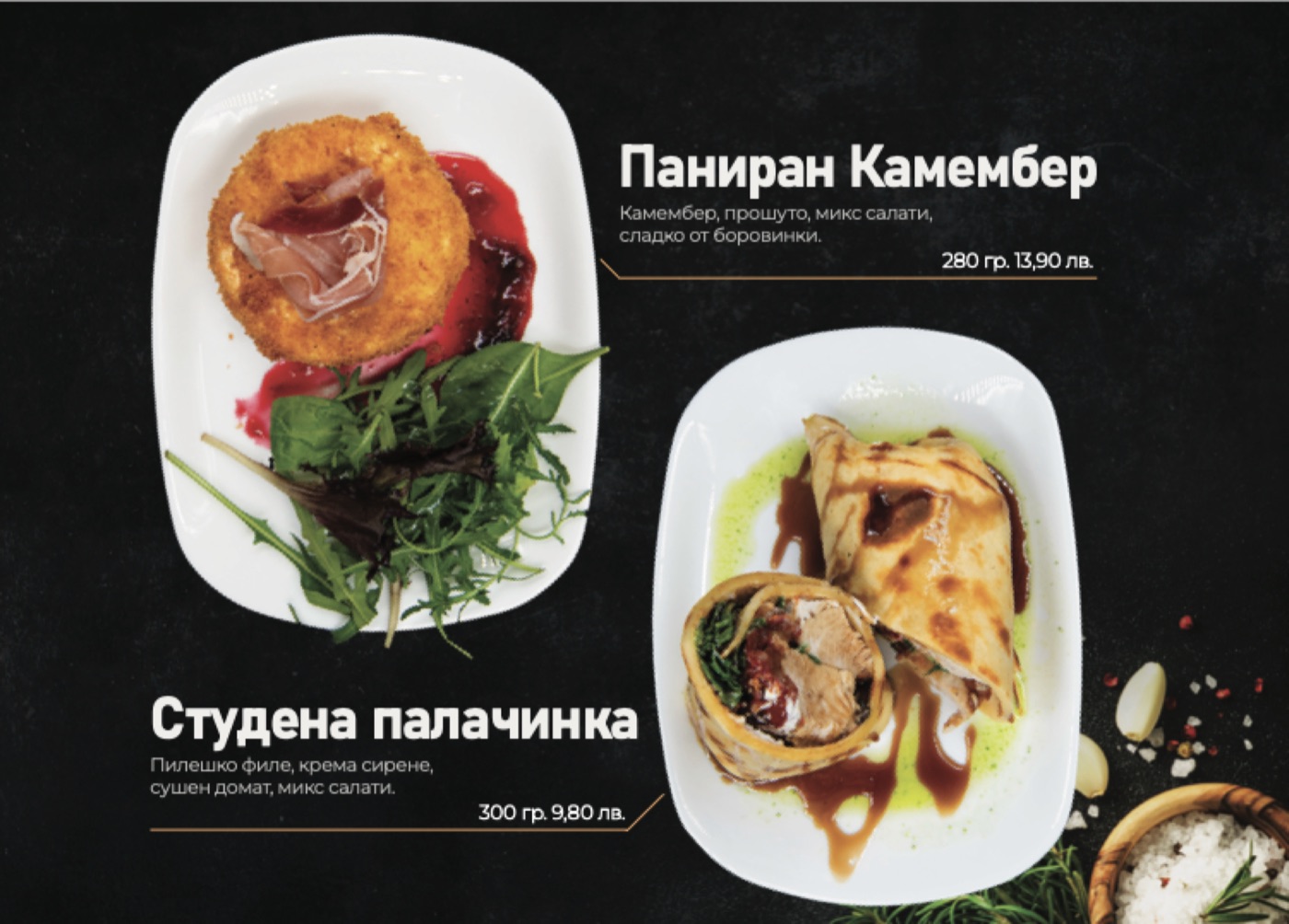
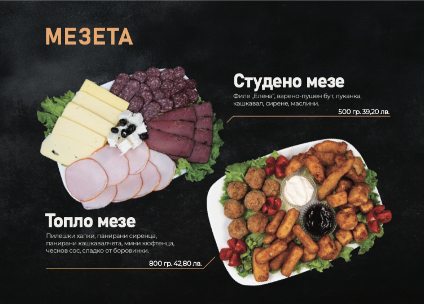
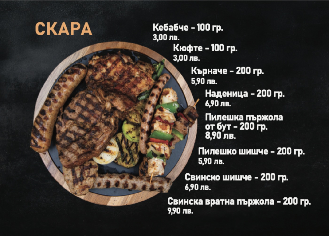
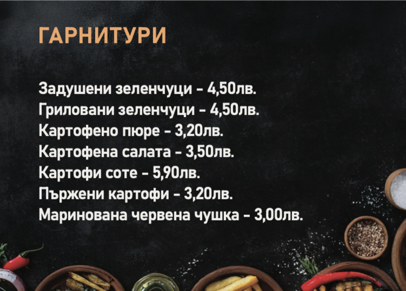
Menu
Layout

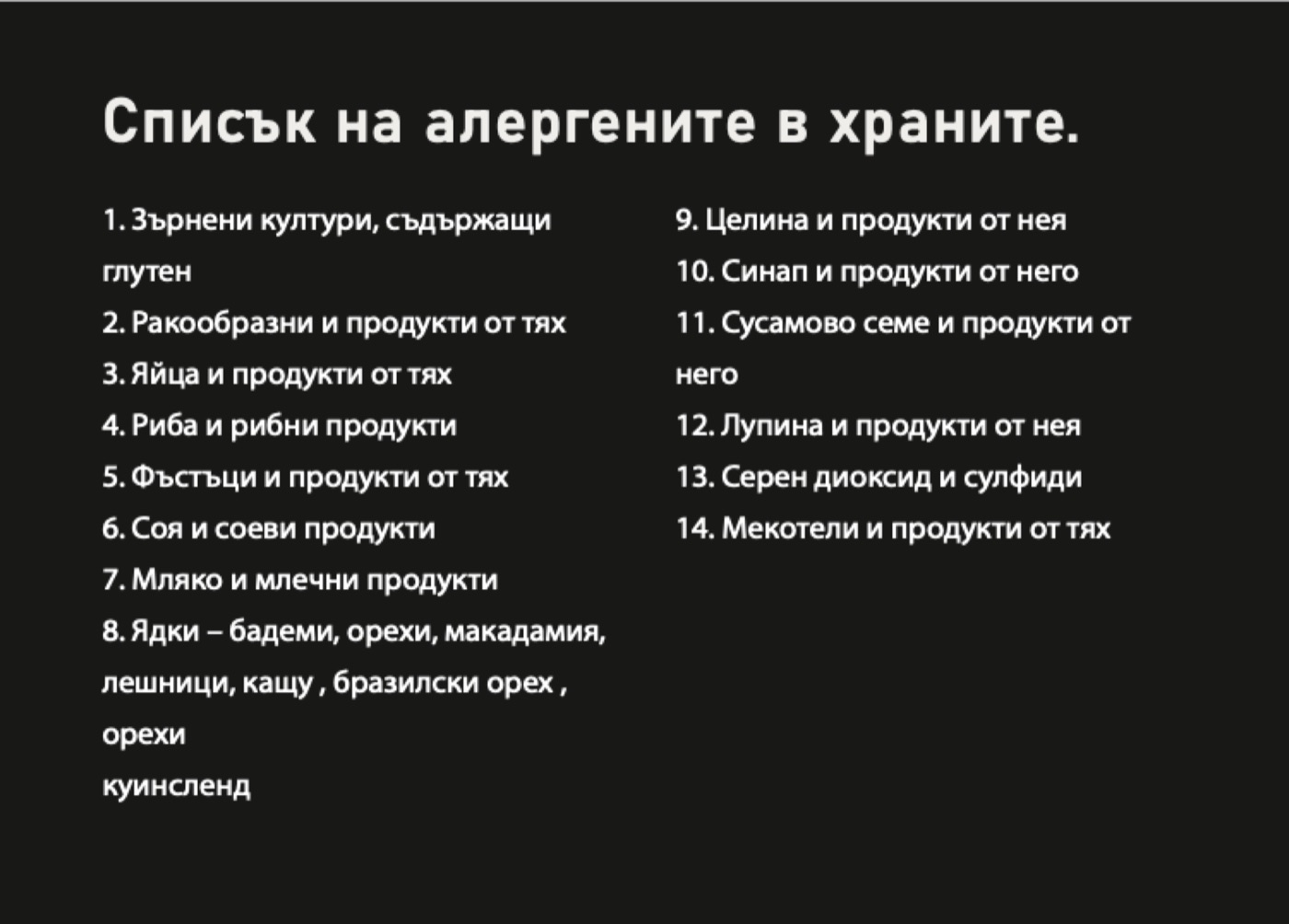
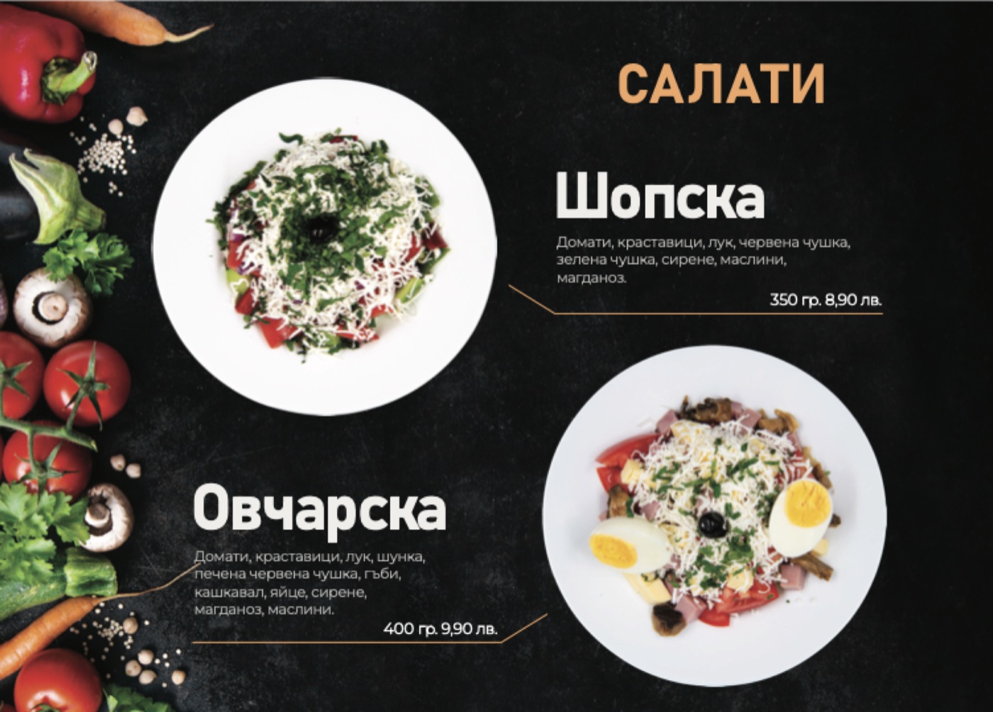
Every dish the same way: section in orange, name in capitals, ingredients in one line, the price on a thin orange rule.

Домати, краставици, лук, червена чушка, зелена чушка, сирене, маслини, магданоз.
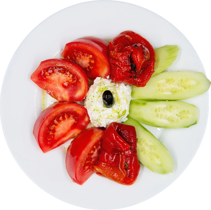
Section — Bahnschrift, Bogota OrangeDish — BahnschriftIngredients — MontserratPrice — on an orange hairline
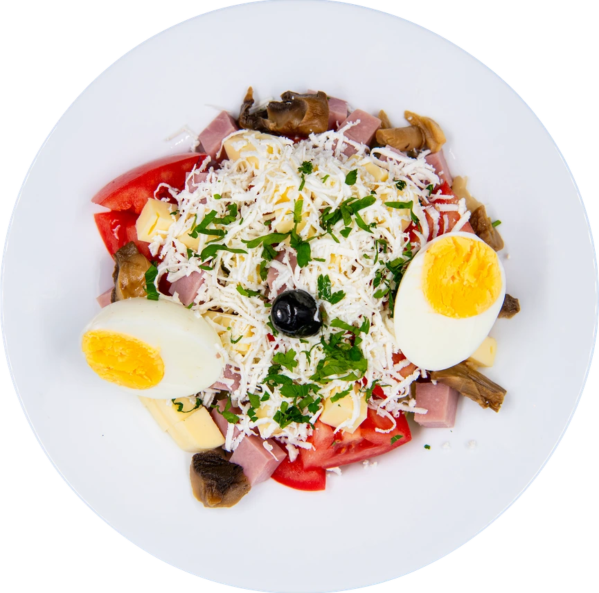
Shopska salad, plated, from above
09 / 09

Food
Photography

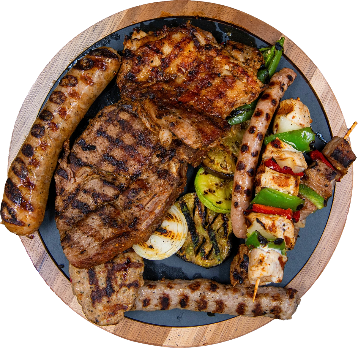
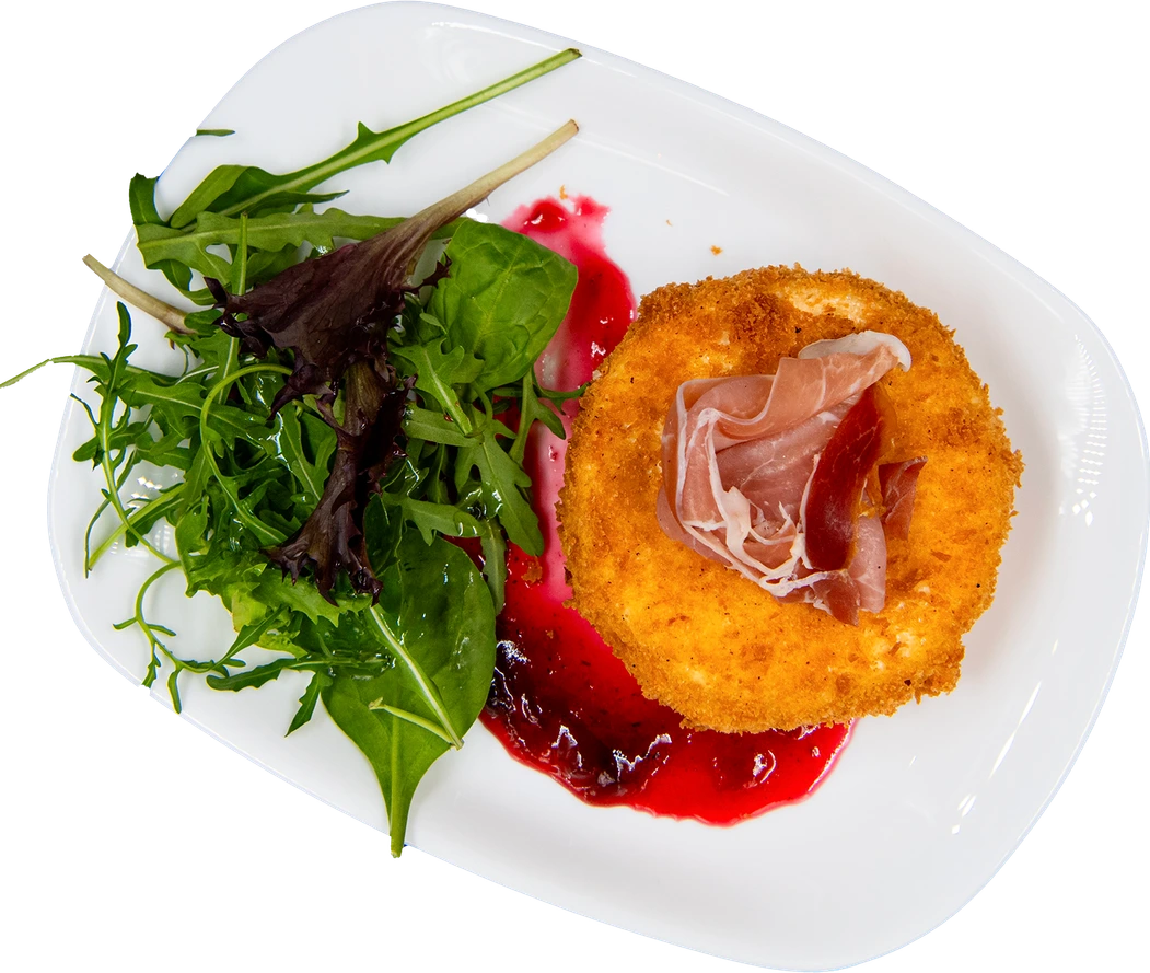
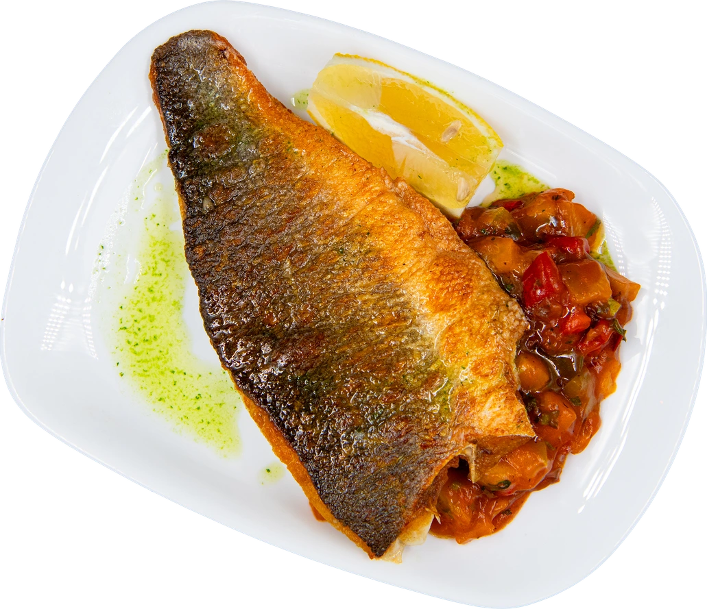
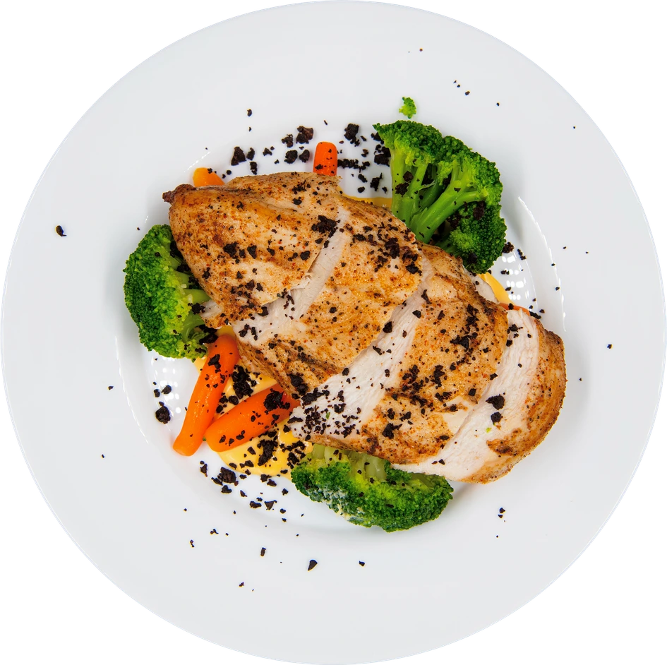
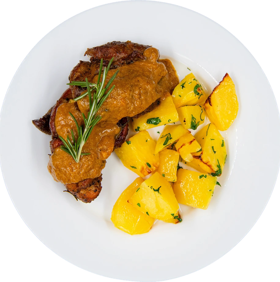
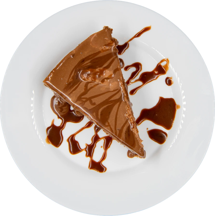
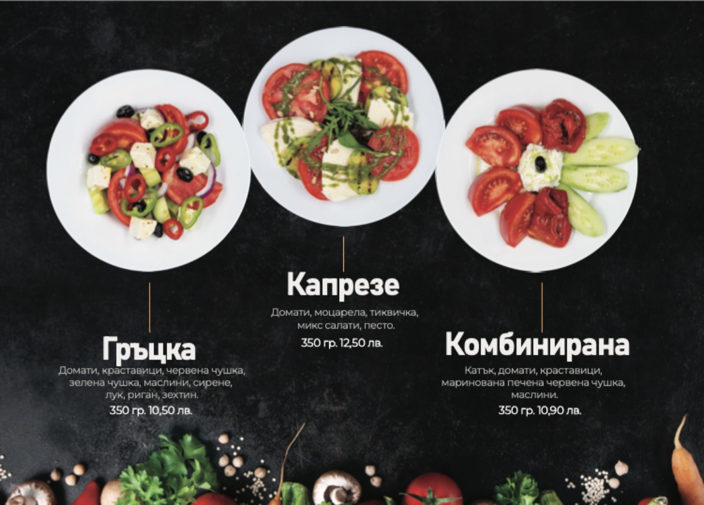
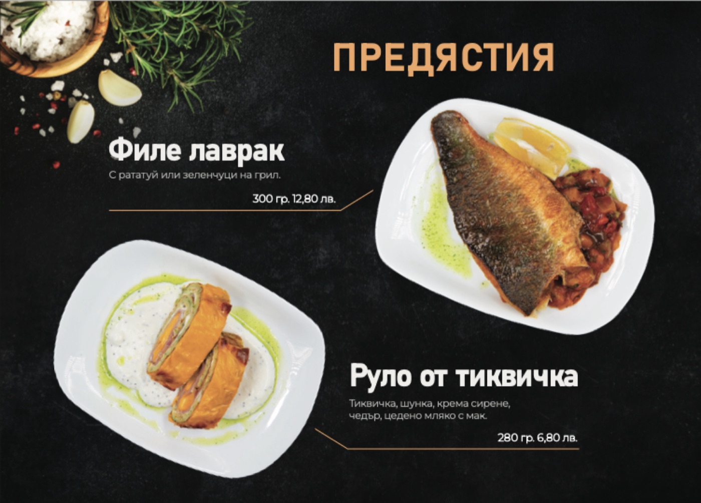
Every dish shot from above and cut out, so the plates sit on the black of the menu and the site.

Shopska salad Mixed grill Breaded camembert Sea bass fillet Chicken fillet Ovcharska salad Pork shank Nutella cake
Open online, too.

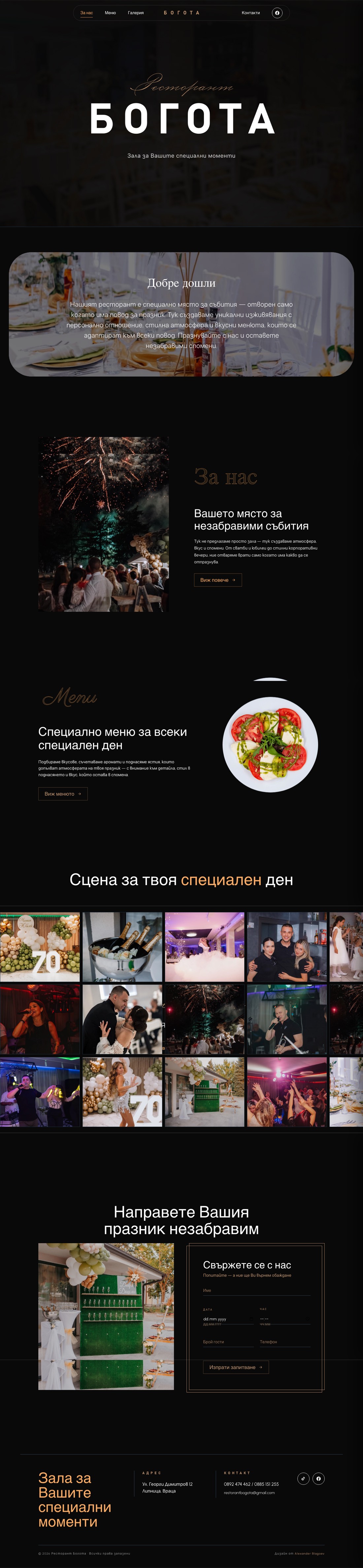
The venue, the menu, a gallery of evenings and a booking form, designed and built from scratch, live at restorantbogota.com.

Visit the live site ↗

restorantbogota.com
restorantbogota.com on desktop, top to bottom
restorantbogota.com on a phone, top to bottom
3
Deliverables from scratch
01
Live client website
∞
Special evenings ahead
— Next Project
Olli App
→