Project02 CategoryApp Design DeliverableUX / UI / Branding IndustryFood Delivery

Bringing your cooking
skills to the maximum

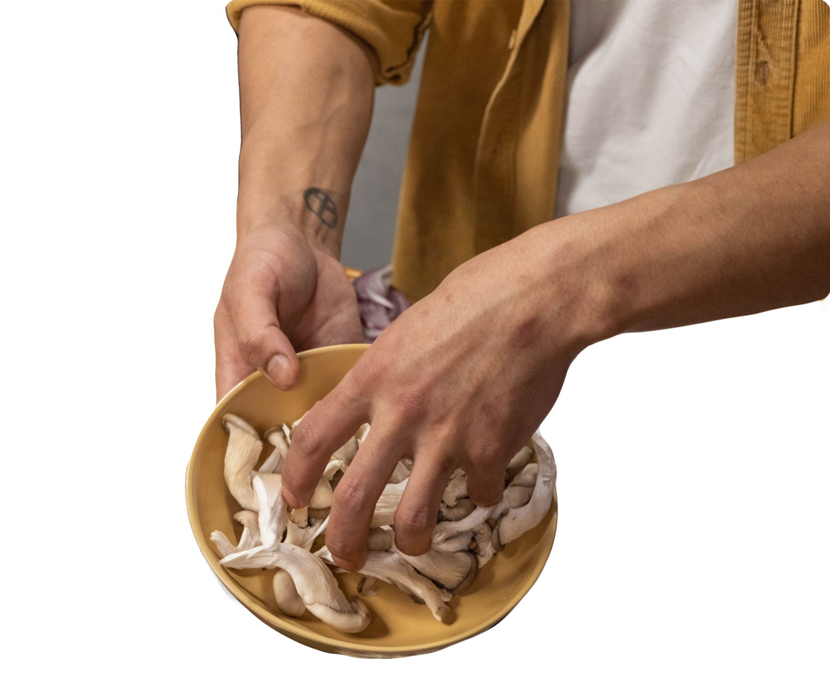
Hands lifting oyster mushrooms from a bowl

Cooking made simple.

Ingredients made personal.
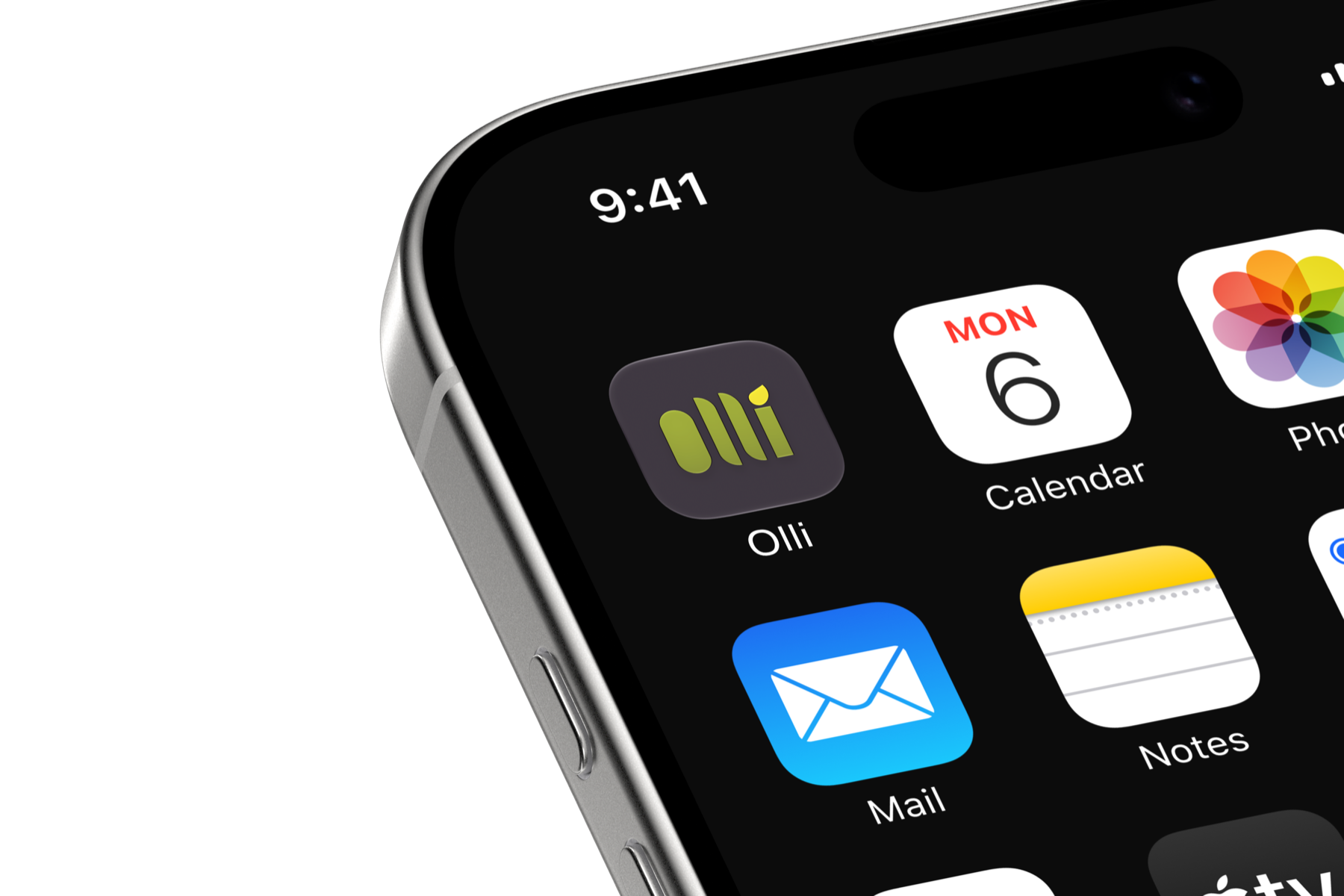
The Olli app icon on an iPhone home screen

Soooo… What’s Olli?

Olli is a meal subscription service built around the idea that cooking should feel like a choice, not a chore. Users browse a curated selection of recipes, pick what they want to make that week, and the exact ingredients arrive at their door — nothing more, nothing wasted.

The app goes beyond delivery. Each recipe comes with a step-by-step cooking tutorial built directly into the interface — timed, visual, and designed to guide you through the process without ever leaving the app.

The design challenge was building something that felt warm and approachable without losing the clean confidence of a premium product. The result is an interface that respects your time and makes the kitchen feel less intimidating.

01  — The Design SystemFigma → SwiftUI

Specified in Figma, built in SwiftUI.

A complete design system — brand, colour, type, grid and an 86-component library across twelve Figma pages — translated into a running iOS app, every value read from the source file.

01 / 05

Logo

Four rounded strokes and a leaf for the dot of the i. Avocado on Jet as standard, a single colour where it has to be, and the app icon.

02 / 05

Colour

A 60-30-10 palette that adapts: sixty percent Seasalt, thirty Jet, ten Avocado. Every colour is an adaptive token, so light and dark are one system rather than two sets of values.

PrimaryAvocado #9EB22B#C5D180#5F6B1A
SecondaryJet #3E363F#8B868C#191619
TertiarySeasalt #F9F9F9#959595
AccentSun / Link #FEEA00#91B4FA
60% Seasalt30% Jet10%
03 / 05

Typo­graphy

Poppins for voice, Metropolis for clarity: Poppins sets the three heading levels, Metropolis everything you read. The scale ships tight, at 100% line height.

PoppinsFor voice — headings 1 to 3
MetropolisFor clarity — everything you read
  1. Heading 1Poppins ExtraBold · 48
  2. Heading 2Poppins Bold · 40
  3. Heading 3Poppins Bold · 32
  4. Heading 4Metropolis SemiBold · 24
  5. Heading 5Metropolis Medium · 20
  6. Paragraph textMetropolis Regular · 16
  7. Caption textMetropolis Medium · 12
04 / 05

Compo­nents

Every variant, built to spec. Buttons vary by style and tier, recipe cards come in two footprints, fields carry four states — all rebuilt as typed SwiftUI components, not static images.

Buttons
SolidButtonButtonButtonButton OutlineButtonButtonButtonButton PrimarySecondaryTertiaryAccent
Recipe card — two footprints
Hall of fame
Chipotle Burrito Bowl30 min
New
Creamy Tuscan Pasta25 min
149 × 212339 × 123
Field states DefaultFocusedErrorSuccess
Spacing — 8pt grid
81624 324048
Radii
5121830
05 / 05

Design
Audit

Building a design system is the fastest way to test it. Two problems surfaced that a static file would never have shown.

01

A button label that couldn't fit its button

The symbol sheet draws every button at 246 × 68 with a 32pt label, but every real one in the flow is 40–44pt tall. Fixed with a proportional size ramp that keeps the spec for reference.

Button246 × 68 spec
Button44pt in every screen
02

Two palettes in one file

The Colors page documents Avocado as primary, but the button symbols still painted an earlier purple and mint palette across 32 instances. The build follows the documented palette, and the old values are flagged.

On the button symbols
On the Colors page
02  — The App6 screens

From stranger to first box.

The path a new user takes, in the SwiftUI build. Each step asks one thing and shows how far along you are. Scroll, and the phone taps through it.

  1. 01

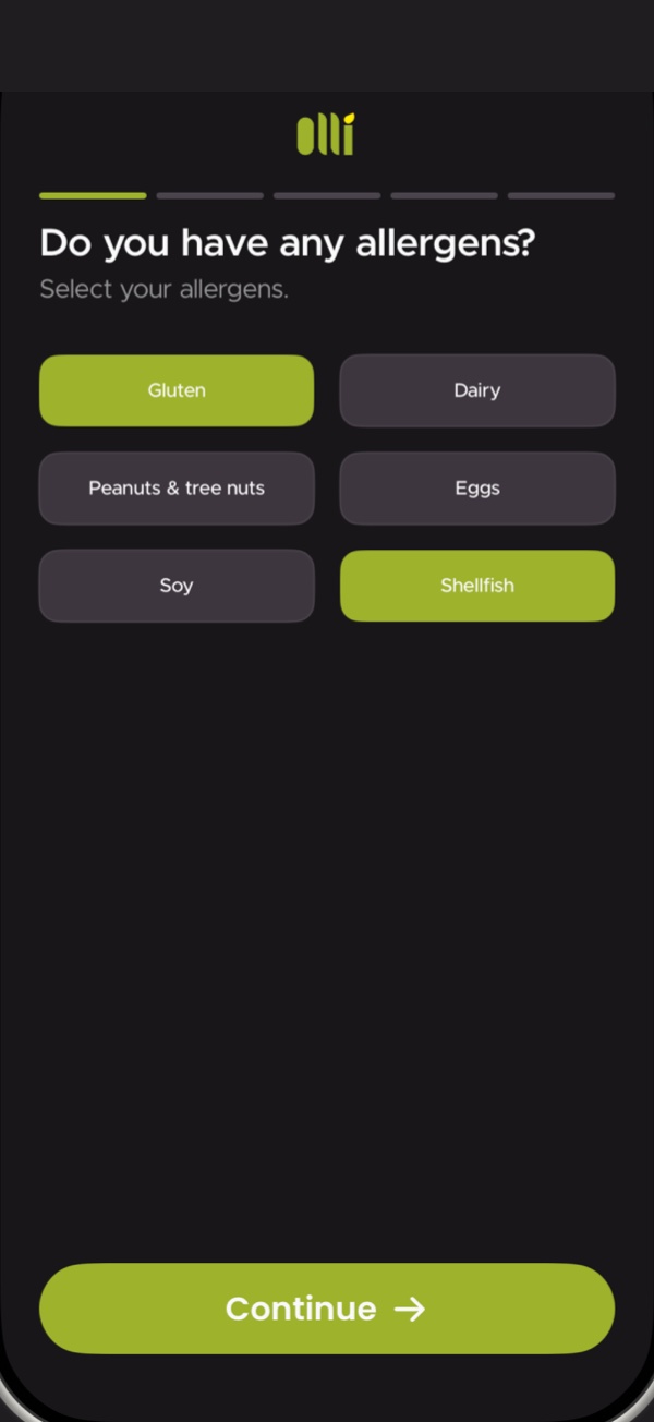
    Allergens

    Onboarding starts with what you can't eat: tap your allergens once and they're kept out of every week.

  2. 02

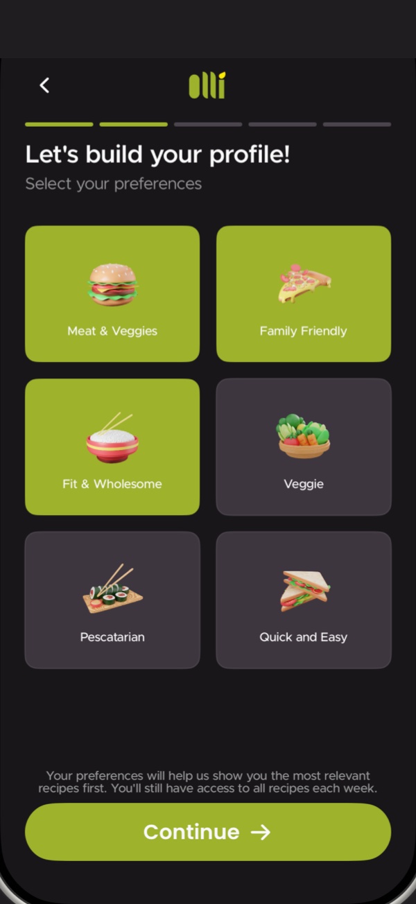
    Preferences

    Then how you like to eat — Meat & Veggies, Family Friendly, Fit & Wholesome, Veggie, Pescatarian, Quick and Easy. The feed leads with what you pick.

  3. 03

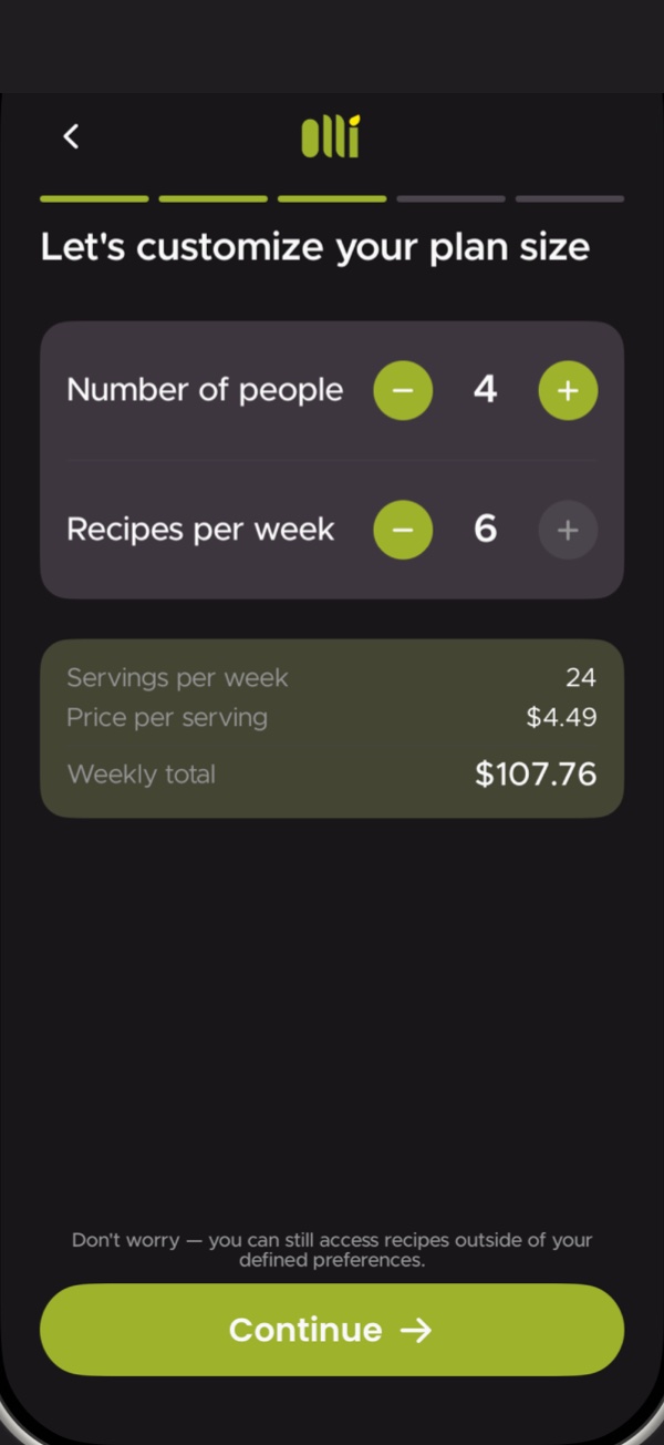
    Plan size

    People and recipes per week, each with a − and a +. Servings, price per serving and the weekly total update as you go.

  4. 04

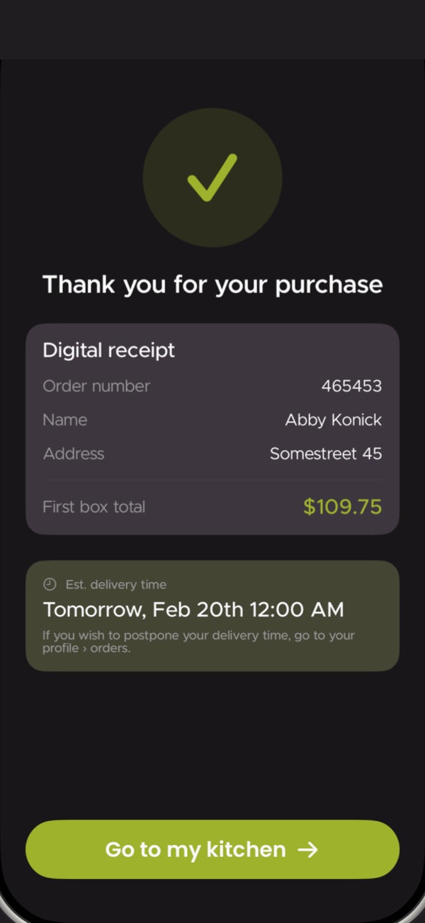
    Checkout

    No surprises: the receipt shows what you paid and exactly when the box arrives.

  5. 05

    Your kitchen

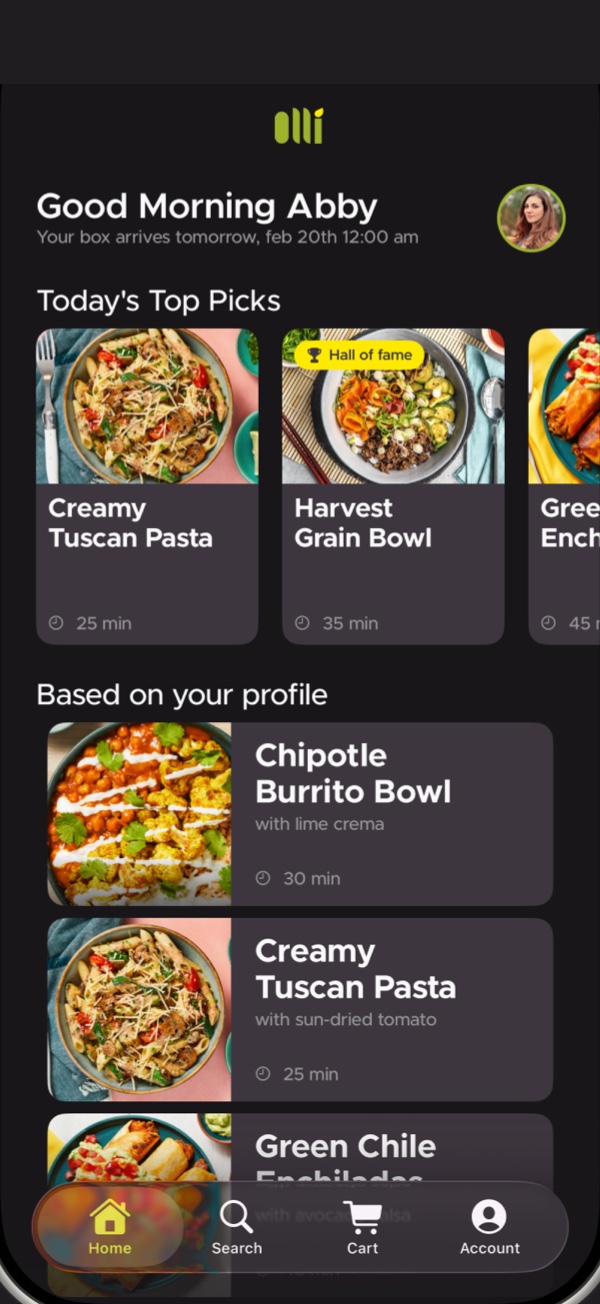
    Home greets you by name, says when the box lands, and leads with this week's top picks and recipes chosen for your profile.

  6. 06

    Account

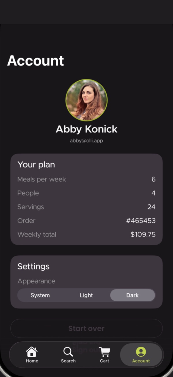
    Your plan, your orders and the app's appearance — system, light or dark — on one screen, behind iOS's own Liquid Glass tab bar.
1,358
Layers decoded
86
Components
12
Figma pages
25
Screens designed