01 / 09
Primary
Logo
The wave and the name together: the brand's signature, on light and on dark.
A self-initiated clothing brand built around freedom, movement, and the colour between pink and purple. Identity, art direction, and 3D campaign imagery — all from scratch.
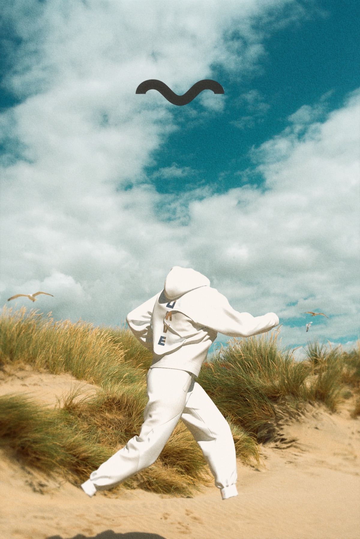
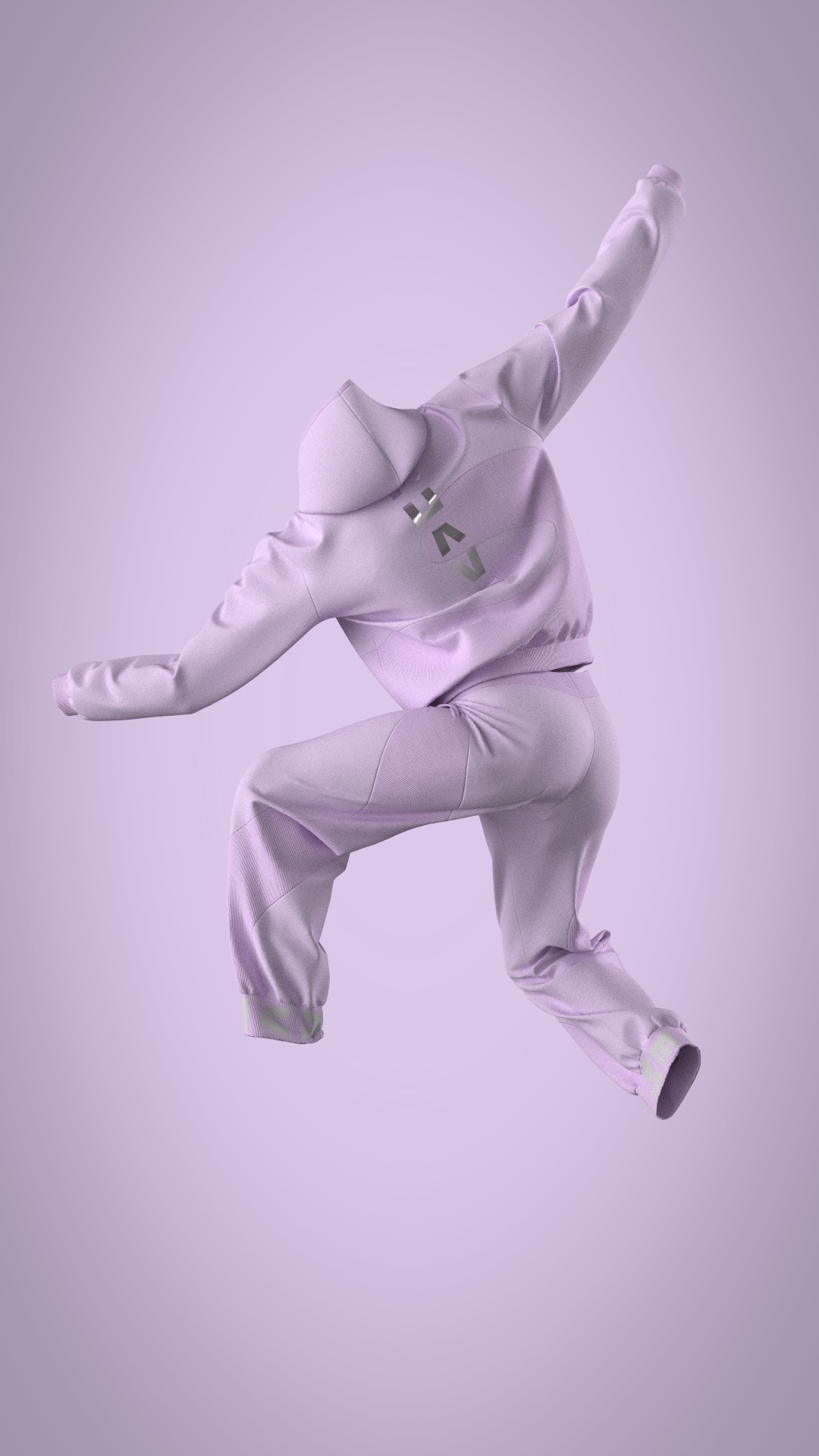
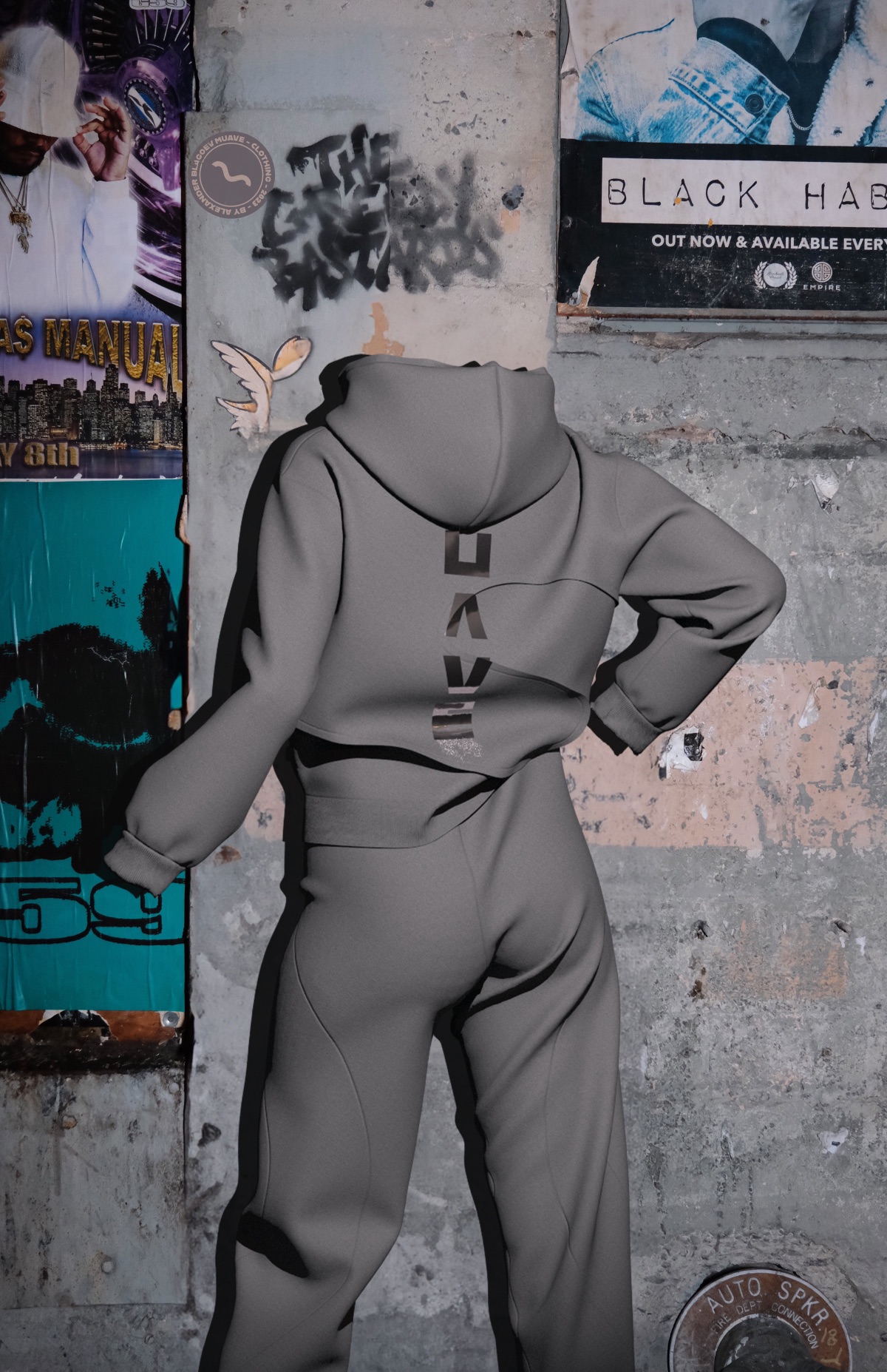
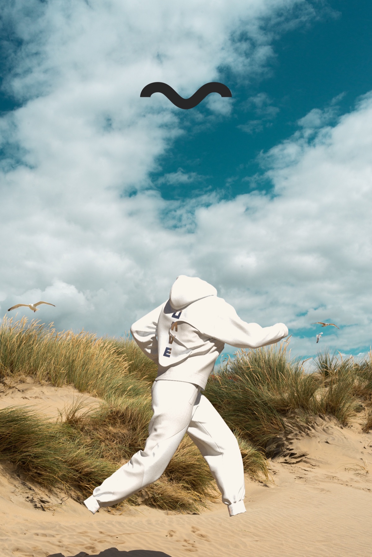
Muave started as a question: what does a clothing brand look like when it removes the person and keeps the movement? Every campaign image is deliberately headless — the focus shifts entirely to the garment, the pose, the environment.
The name sits in the space between mauve (the colour) and move (the action). The wave logo — a stylised M — carries the same duality: fluid and structured, soft and bold.
The brand was built end-to-end as a personal project: identity, colour system, typography, 3D product renders, and a full campaign — designed to feel like a real label from day one.
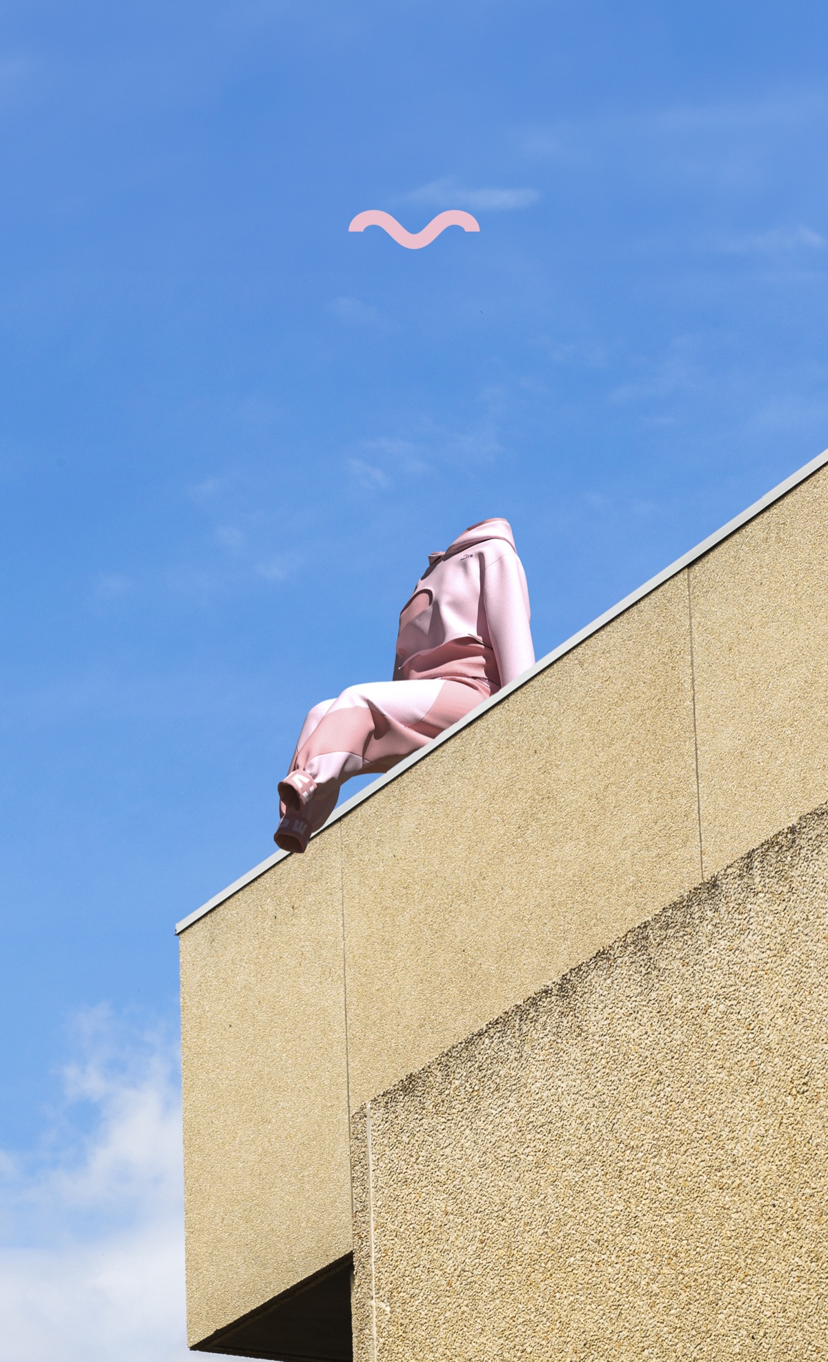
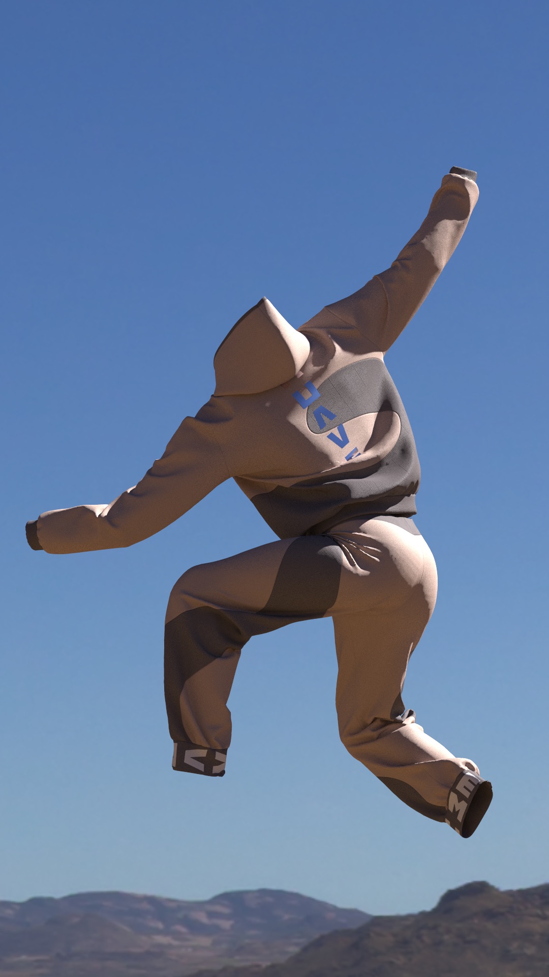
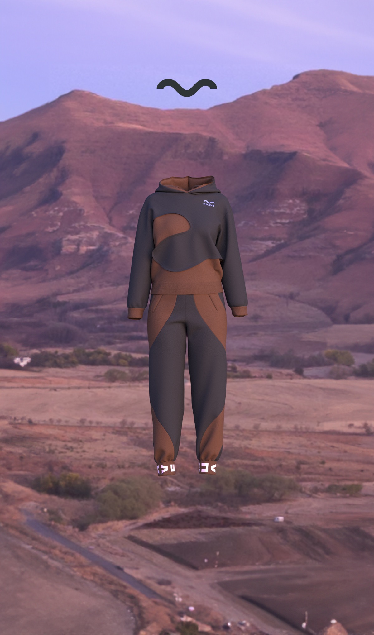
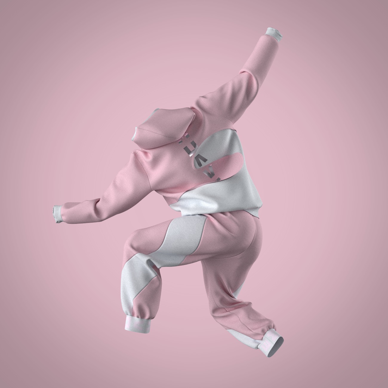
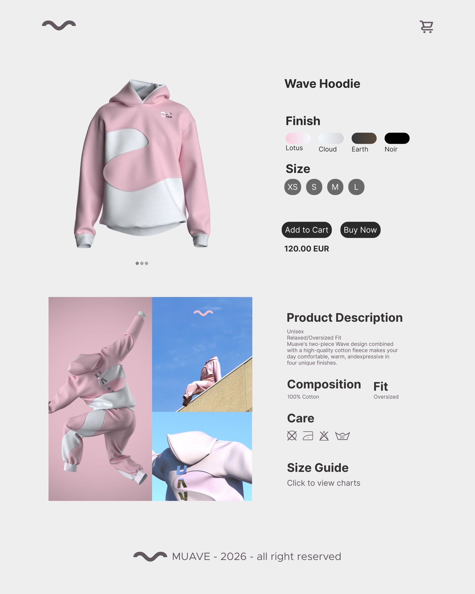
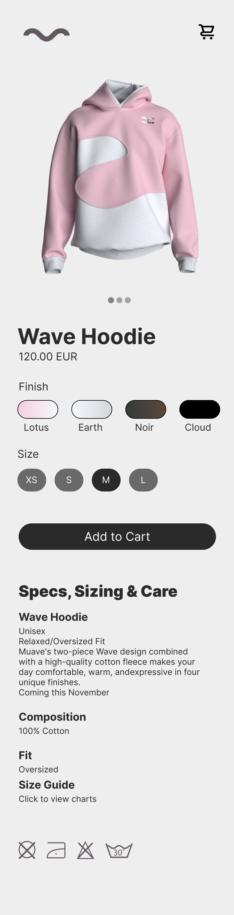
A product page for the Wave Hoodie: four finishes (Lotus, Cloud, Earth and Noir), four sizes, and the fit, fabric and care at a glance. Designed for desktop and phone.